In an earlier post I noted how the actual data on risk/return
on various mxes of stocks and bonds didn’t line up with the academic
presentation of the relationship. Because of this it is useful to reopen the
discussion of what is the optimal choice of stock bond allocation
Does standard deviation really matter to investors ?
Warren Buffet noted the following in his annual letter as reported by the wsj
(by currency denominated instruments cds and bonds which
offer poor inflation adjusted returns)
Stock prices will always be far more volatile
than cash-equivalent holdings. Over the long term, however,
currency-denominated instruments are riskier investments – far riskier
investments – than widely-diversified stock portfolios that are bought over time
and that are owned in a manner invoking only token fees and commissions. That
lesson has not customarily been taught in business schools, where volatility is
almost universally used as a proxy for risk. Though this pedagogic assumption
makes for easy teaching, it is dead wrong: Volatility is far from synonymous
with risk. Popular formulas that equate the two terms lead students, investors
and CEOs astray.
He concedes that short-term ownership of stocks
is more volatile and therefore it makes sense for certain types of investors, …,
to tie stock-price movements to risk
Although standard deviation
is indeed the measure of the riskiness of a portfolio that seems to be the
favorite of virtually every finance professor I would also argue that it is not
very relevant to most investors. My view is along the same direction as Buffet’s
but my focus is a bit different.
Standard deviation is a
measure of the volatility of a portfolio. But most investors don’t or shouldn’t
care about price volatility as a measure of risk. In fact most know that short
term volatility shouldn’t influence their investment decisions and that for
money that they might need in the near term it shouldn’t be invested in stocks….At
least they know that intellectually even if they have trouble implementing it
in practice. I have never seen a client answer a risk questionnaire that asks
what they would do in response to a short term market drop as ‘sell everything”
but we all know investors do exactly that. In fact one of the most important
things an investment advisor can do is prevent you from trading and investing
in stocks with a short time horizon and selling (or buying) in response to
short term market movements.
What really concerns
investors is how much they might lose on their portfolio. A simple answer of
course would be that holding more bonds and less stocks reduces the potential
for loss and increases potential returns. And this concern should be over
longer time frames…since stocks should never be regarded as a short term
holding.
Taking the analysis the next
step in approaching the choice of a stock bond allocation the most relevant question ... how much extra risk an investor should take in exchange for potential
return.
Many "risk tolerance questionnaires" include a question like this in which the risk reward ot each alternative is symmetrical the upside and downside are of the same magnitude (the potential gain is equal to the potential loss in each case) In an example like this the choice is very clear..more risk equals more potential loss and more potential gains.

However as will be seen in the rest of this article, in the real world things don't line up the way they do in the above graph. There are times where the potential incremental upside potential may not be the same as the potential downside risk. Knowing that information would be a key input in deciding upon an appropriate stock bond allocation..and it is not as simple as the above hypothetical.Many "risk tolerance questionnaires" include a question like this in which the risk reward ot each alternative is symmetrical the upside and downside are of the same magnitude (the potential gain is equal to the potential loss in each case) In an example like this the choice is very clear..more risk equals more potential loss and more potential gains.

To give a simple example few investors would think it reasonable (or should if they are “rational investors”)to add to their stock allocation if it increased their potential gain from 10% to 15% and increased their potential loss from -10% to -20%. That is simply a poor risk return tradeoff. In the real world there are points at which adding or reducing the % of stocks relative to bonds will give an asymmetric payoff...the increase in upside is greater than the increase in downside risk when adding to stocks..based on historical data.
It is possible to calculate this using historical data in terms of the range of returns and the best/worst and average returns for a portfolio allocation. I have done this analysis for a mix of total world stock /total us bond market allocations. The data is presented for 1,3, 5 and tenyears. It gives an idea where the what I call the “sweet spot’ is for an allocation the point .. the point beyond which adding stocks makes significantly less additional upside than the downside and a relatively small difference in average returns. It would correspond somewhat to what the risk/standard deviation approach of the finance professors call the 'efficient frontier'
Of course finance is not physics and this is historical data..but it is something to use as a basis for decision making. It does show the benefit of adding to the stock allocation increases as the time horizon gets longer but the real world is certainly not the idealized version in the above risk tolerance questionaire.
Below are the results for one year periods. The bar graphs show the range of returns and the numbers give the highest lowest and average. Ideally the investor would want to choose the mix which would offer the highest upside and the lowest downside. Or put another way a portfolio where the part of the bar graph above the zero line was far larger than the part below that line.
Obviously this doesn't exist. As one increases the upside potential the downside potential moves up as well. But what is important is that the relationship isnt' linear or nearly as that as predicted by the professor's graph shown in the earlier post.
For example one could compare two allocations be based on the size of the bar graph which represents the range of returns, the best and worst year and the average return.
One could compare the 80% allocation which has the following
best period +34.78
worst period -34.6%
average return 8.84%
and the 60% allocation
best period 28.03%
worst period -26%
average return 8.28%
and see that in order to get a higher average return of .56% the investor is trading off a much larger range of returns and a much lower worst one year loss.With the 60% return the historical worst case is leass extreme (smaller absolute value =26%) vs the upside (+28.03%) while in the 80% allocation they are basically identical at a +34.78 and -34.6%
One can review the numbers to see where the incremental return is worth the incremental risk. it seems to "sweet spot" lies somewhere in the 60-65% level adding more stocks beyond that seems to add little in terms of average return in exchange for larger risk.

Below are results for 3 year periods. Once again the "sweet spot" in terms of risk of loss per unit of gain, average returns and range of returns seems to fall in the 60 to 65% range. Note that going from 60% to 80% stocks -
raises the maximum downside form-15.93% to -28.7% but only increases the average return from 27.34% to 29.84%
A risk adverse investor for example one already in or very close to retirement might well choose the 50/50 allocation whose worst period was -9.06% in exchange for a lower average return.

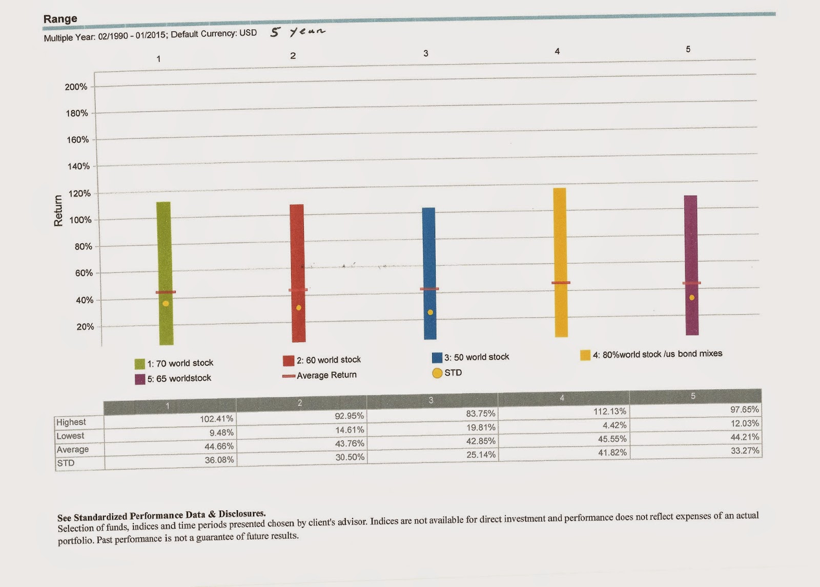
Here are the 5 year numbers. Particularly interesting is that across all the allocations there is
not a single 5 year period with negative returns . Readers can make their own judgements as to the sweet spot it seems around 60 to 65%stocks. but as the time frame increases it does indeed look like the risk return of a large stock allocation does look more attractive. The 60% allocation here has a high upside of 92.95%, downside 14.61% and average return of 43.76%. Increasing the stock allocation to 70% raises the upside by nearly 10% to 102.41 while the worst downside is a bit more than 5% worse at 9.48% and the average return 44.66% vs 43.76% for 60% stocks

For the real world long term investor this means that if he is willing to align his behavior to what he knows it should be --and mostly like his answers on a risk questionnaire-- he will be rewarded for holding more stocks as his time frame increases. But this will only happen if he --perhaps with the reinforcement of a good advisor--looks past the inevitable short term volatility or more precisely downside volatility, And the risk and return tradeoff based on historical data is not as simple and linear as in the textbook or "risk tolerance survey".
In any event this approach of looking at the range of returns is a much more relevant way for an investor to quantify his risk than looking at the standard deviation measure favored by the professors.
No comments:
Post a Comment